Avería is easy on the eyes
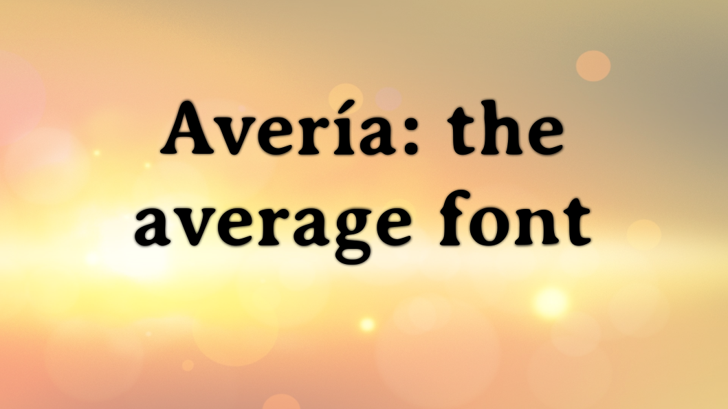
Avería: the average font I spend more time than I care to admit staring at computer screens. It’s an occupational hazard, literally, of writing about tech for a living. Much of that time is spent staring into the abyss a text editor, in this case Emacs. That being the case, I have test-driven quite a few different fonts to find one that is: Pleasant to look at and isn’t boring. Easy to read. Displays code nicely. Makes it easy to distinguish characters like l and 1. I ran across Avería recently and it immediately caught my eye. It is, according to its web site, “the average of all fonts” on the creator’s computer. Somehow, at least to my aging eyes, it looks simultaneously classic and modern. ...